What is a Sparkline?

 |
| An Example of Using a Sparkline Graph in a Table |
This table of historical financial data would just be a wall of numbers to most people, and looking for patterns would be challenging. However, by adding a small, word-sized graphic to each row it is easy to see at a glance some interesting patterns. Why is spending on "Books and Supplies" so much higher in 2019-20 than the rest of the years? How about "Capital Outlay"? Also at a glance it is easy to spot the moment when the district moved from running consistent surpluses to running regular deficits.
Here's an example that might be used in either a student or employee attendance situation:
 |
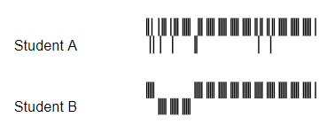
| A Win-Loss Chart Revealing Attendance Patterns |
Imagine you are a busy assistant principal that has been tasked with reducing chronic absenteeism in your school. Your student Information System may be capable if generating a list of students deemed chronically absent (defined in California as being absent ten or percent of the days enrolled), but how would you know which students are likely to be ongoing attendance concerns? Would a report like this, that actually revealed the attendance patterns, help focus your effort? If you have five minutes before your next meeting to make a quick contact, which student's parent would you call?
 |
| Another Win-Loss Chart Used to Prioritize Attendance Efforts |
How To Create A Sparkline Chart in Google Sheets
Sparklines are created in cells using the SPARKLINE() formula. The basic form is:
=SPARKLINE(data, [options])
where 'data' is the range of cells that contain the information you want on your chart, and 'options' are used to modify the appearance. 'options' are indeed optional. though you'll definitely want to learn several of them to get the most of sparkline charts.

In the most basic form, the SPARKLINE() formula generates a line graph from the data, read left-to-right (there is an option to reverse this if necessary). What if we want a column graph instead?

By adding a "charttype" option we are able to change the graph from a line graph to a column graph. Now that we know how to change the type, let's jazz up the graph a bit.
Here we've added a second option to set the color of the highest value in the data set.
The syntax for 'options' is a little awkward. All of the options are wrapped in a set of curly braces {}. Then each option is combination of a keyword (like 'charttype') and a value (like 'column'), separated by commas. Additional options can be added and are separated by a semicolon. For clarity, here is the formula for the last chart:
=sparkline(A1:E1,{"charttype","column"; "highcolor", "green"})
Rather than list every possible option and setting, let me point you to Google's own documentation on the command: https://support.google.com/docs/answer/3093289?hl=en
Summary
Sparklines are an excellent way to add context and meaning to text-heavy documents and presentations. They may take a little work to get the hang of them, but they can be invaluable in getting your message across.
Thanks for reading!
Chris
Comments
Post a Comment